Brand Messaging & Strategic Positioning
This portfolio highlights messaging systems I’ve built with mission-driven brands, including staff communications, program collateral, and brand identity refreshes. Every project blends strategic clarity with thoughtful execution to ensure consistency, cohesion, and confidence across all touchpoints.
Case Studies
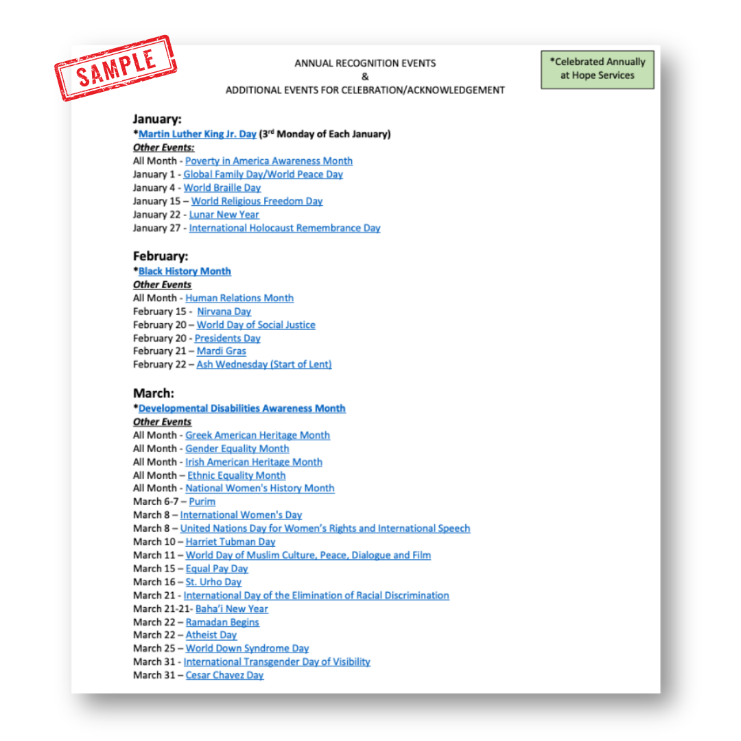
DEI Calendar Collaboration & Messaging Integration
The DEI Committee at Hope Services had important initiatives and cultural observances planned throughout the year—but they were often siloed from core organizational communications. Messaging lacked cohesion, and the absence of a unified voice made it difficult to ensure consistency, clarity, or visibility across channels.
I recognized this disconnect and initiated a cross-functional process to bring alignment between DEI efforts and the broader marketing and development functions.
The Process:
Surfaced the Gap to Leadership: I raised the need for a more integrated DEI communications structure with key leaders and helped secure buy-in from the DEI Committee and Executive stakeholders by outlining the risks of misalignment and the opportunity to build shared visibility around DEI priorities.
Built the Bridge: I worked with the DEI Committee to gather their planned observances, themes, and goals. From there, subcommittees created a unified calendar and I mapped DEI priorities onto existing marketing and fundraising timelines—ensuring they would be planned for, not treated as last-minute add-ons.
Established a Messaging System: I guided the development of a process where DEI-aligned statements could be drafted, reviewed, and approved by the right internal leaders—particularly those serving on the DEI Committee or executive team—so that Marketing wasn’t positioned as the sole voice or decider on sensitive cultural matters.
Created a Rollout Workflow: Once statements were finalized, I worked with DEI and leadership to build a distribution pipeline. These statements became a foundation for external campaigns, internal announcements, and public-facing stories across social, email, and blog every month, allowing each channel to reflect a unified voice.
The Result:
Improved visibility and engagement with DEI events across the agency.
Stronger internal trust, with clear roles and accountability around messaging.
A replicable, respectful model for communicating about sensitive topics from a place of alignment and authority.
Marketing became an amplifier of values and voices directly from the individuals that most authentically represent the organization.
Skills: Systems Building, DEI Messaging Strategy, Cross-Functional Alignment, Executive Collaboration, Brand Voice Stewardship
Annual Report Redesign & Visual Strategy
Hope Services’ annual report had used the same horizontal layout for years—a slide-deck format that prioritized dense information but lacked narrative flow. Over time, it became harder for stakeholders to read page by page, encouraging skimming rather than engagement. The layout felt utilitarian and crowded, with wide text spans and overly compact content blocks that limited the impact of both visuals and story. It was time for a format that invited readers in, guided them naturally through the content, and reflected the professionalism and warmth of the brand.
We reimagined the report as a vertically oriented, magazine-style publication, intentionally designed for readability and emotional resonance. By switching to a narrower column structure, the report encouraged continuous reading and felt more like a story-driven experience than a corporate summary. We incorporated larger, full-bleed imagery to create visual breathing room and spotlight key moments. Each spread followed a clean, consistent layout system anchored in Hope’s brand motifs: arrow elements, signature colors, and refined typography. Content was simplified, with one story or theme per page to avoid cognitive overload and let each narrative shine.
Result:
The redesigned report elevated Hope Services’ brand presence, garnering praise from board members, donors, and internal stakeholders alike. The cleaner layout and visual storytelling approach made the content more accessible and engaging, encouraging full reads rather than quick scans.
By presenting data and stories side-by-side with clarity and warmth, the report strengthened donor trust, aligned with industry standards, and served as a versatile asset for fundraising, recruitment, and community engagement throughout the year.
Skills: Annual Report Design, Visual Storytelling, Brand Cohesion, Print Strategy
Program Flyers & One-Sheet Redesign
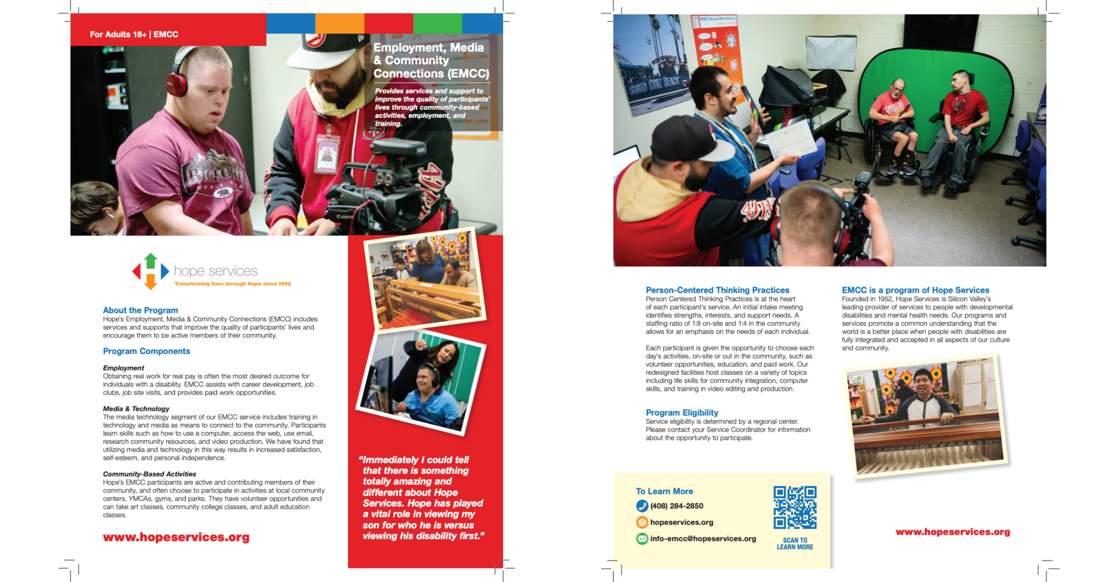
Hope Services’ program flyers were visually outdated and no longer aligned with the organization's evolving brand standards. The designs lacked consistency across departments, and the content structures felt cluttered and difficult to scan—limiting their effectiveness as tools for outreach, education, and fundraising.
I co-directed the redesign project which overhauled a complete suite of flyers—from EMCC, Supported Living Services, Mental Health programs, and others—using a unified design system rooted in Hope’s brand identity. I helped established a clear visual hierarchy, integrated branded motifs, and simplified page title blocks for easier navigation. Each flyer was built to be functional across digital and print settings while staying aligned with the voice, tone, and goals of each service line.
Result:
The refreshed flyer system modernized Hope’s print presence and quickly became a staple across departments.
Staff reported increased ease of use in the field, stronger alignment across program messaging, and more positive reception from external stakeholders.
The redesign reinforced brand credibility and laid the foundation for future collateral projects.
Skills: Print Collateral Design, Brand Messaging, Layout Strategy, Program Marketing
Strong brands start with stronger messaging.


